The Brothel: Inspired by a real brothel in East Earl Court, the director had a clear idea of how it should look: decayed with a fake sophistication, old-fashioned ambience, hidden in a victorian house in West London. We wanted to use the red colour but not in the stereotyped way, the place was not romantic.
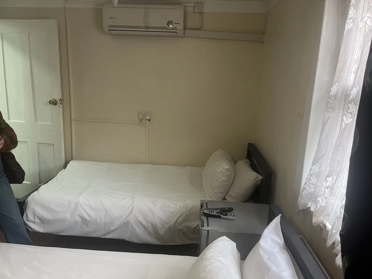
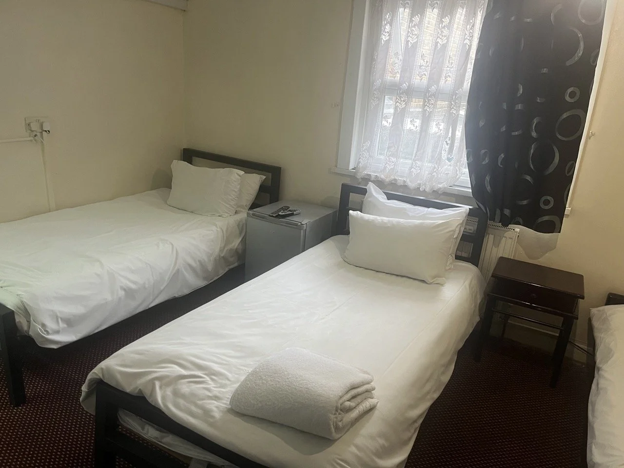
Going for a cheap Hotel/ Motel aesthetic, last refurbished in the 70’s or 80’s , was my choice to make the brothel “homie” and have this professional look at the same time.
The concept:
The Location: To make the budget viable, the chosen location was a humble hotel in East London.
The location offered the architectural spaces we were looking for but, aesthetically was completely different, which demanded a complete remake of the spaces to get the right tone.
Before/ After
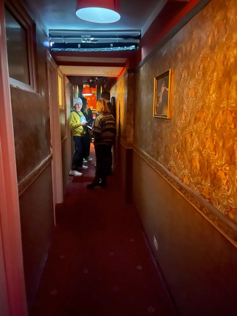
Corridor:
The original corridor was a pinterest nightmare, with many different patterns and colours, even in the ceiling! Random objects fixed in the walls made it more confusing and polluted.
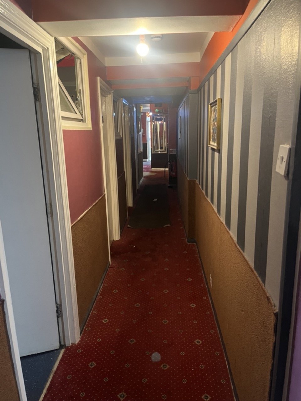
The solution was applying a "reddish” wallpaper to the walls, giving the room a unified and kind of posh vintage charm. We also covered the ceiling in plain brown paper and distressed it all to make it old. Red lampshades and beautiful green velvet curtains were added to close the edges and bring some shine
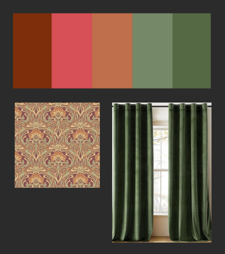
Colour Scheme


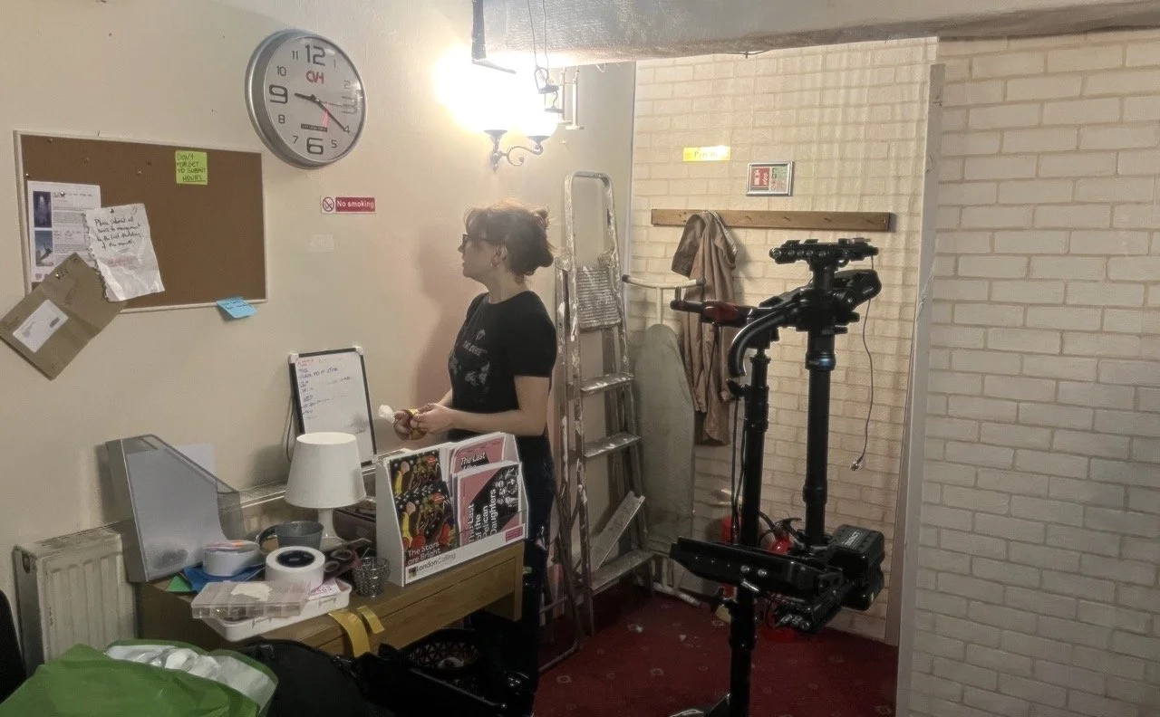
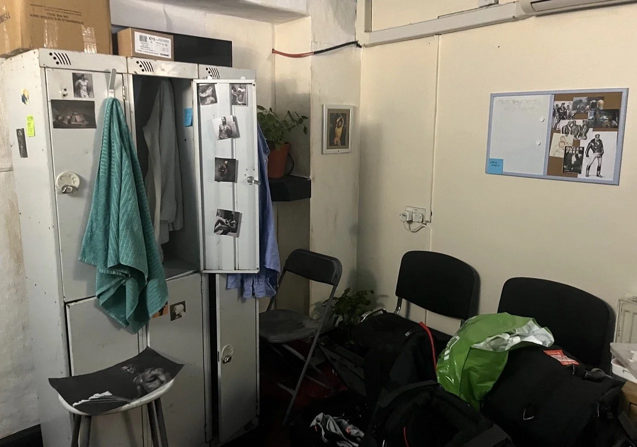
Changing Room/ Mirror:
We wanted a impersonal, cheap e uncomfortable space, showing the brothel didn’t care for their employees. We wanted to stress the sex workers situation and bring this discussion, along immigration, exploitation and prejudice to the table.
For a more claustrophobic feeling, we delimited the space with wooden panels covered in fake bricks. We covered the colourful walls with a embossed wallpaper and painted all in beige, aged and worn. The result was a very boring room.


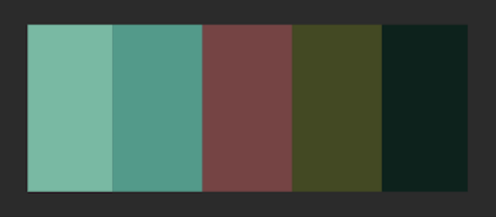
Colour Scheme

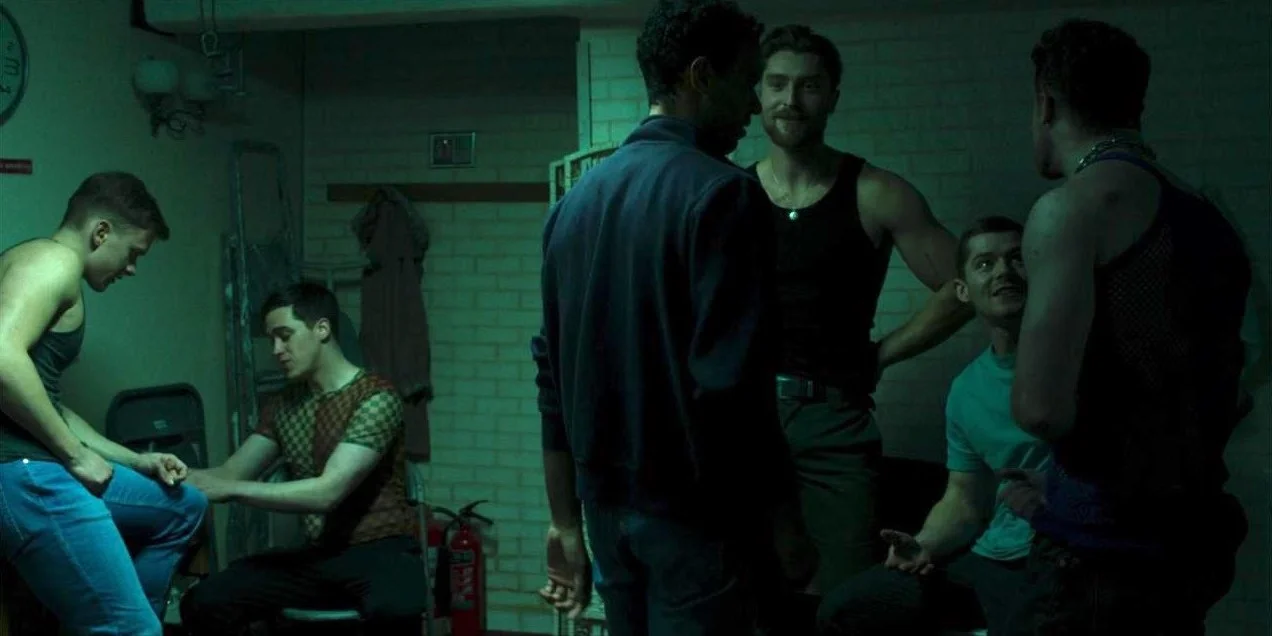
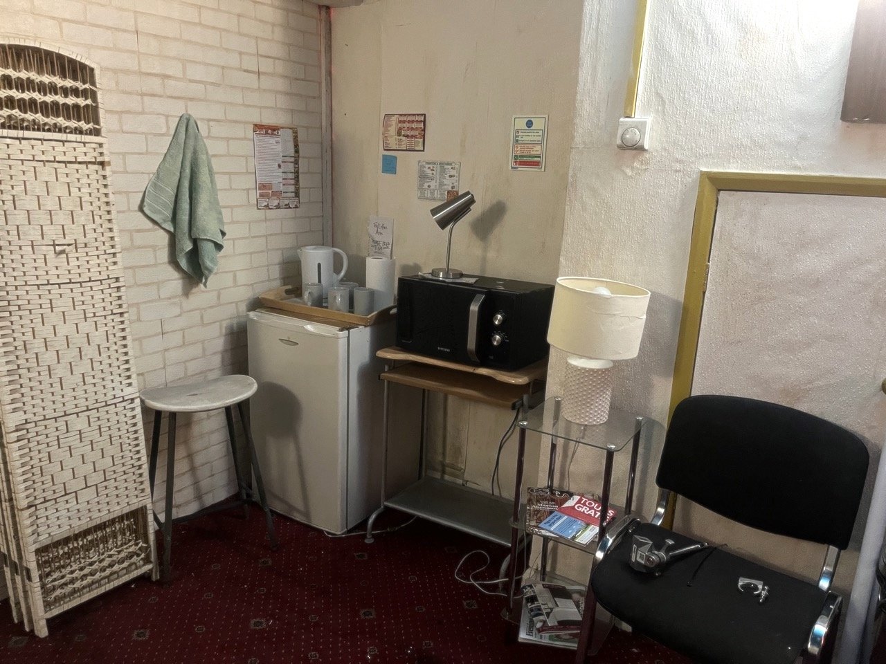
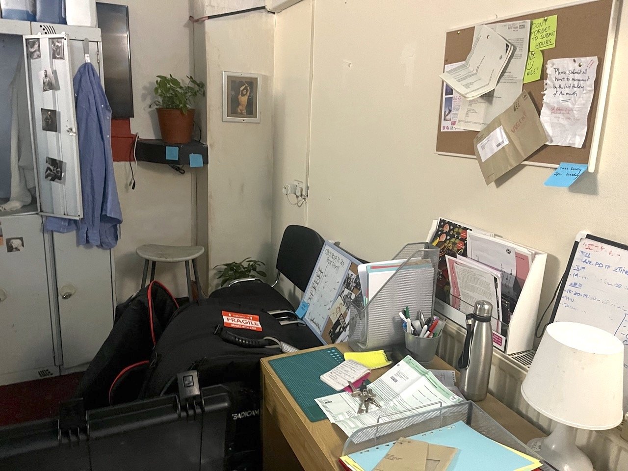
The room was a mix of office, kitchen, fitting room and also the place where the boys were displayed to the clients. The palette comes mostly from the light and from details in the dressing.The props were a kind of improvised, cheap ones, in metal and neutral colours, giving a cold and monotone sensation. The messy also emphasized this careless environment.
Changing Room/ Mirror:

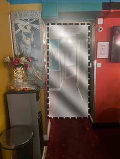
The entrance was closed with a double-faced mirror, working as a window to isolate the clients for the scort-boy’s vision.
Colour Scheme
In this corner, the lockers shown their personal objects and artists and images that are important for the queer identity

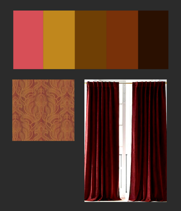
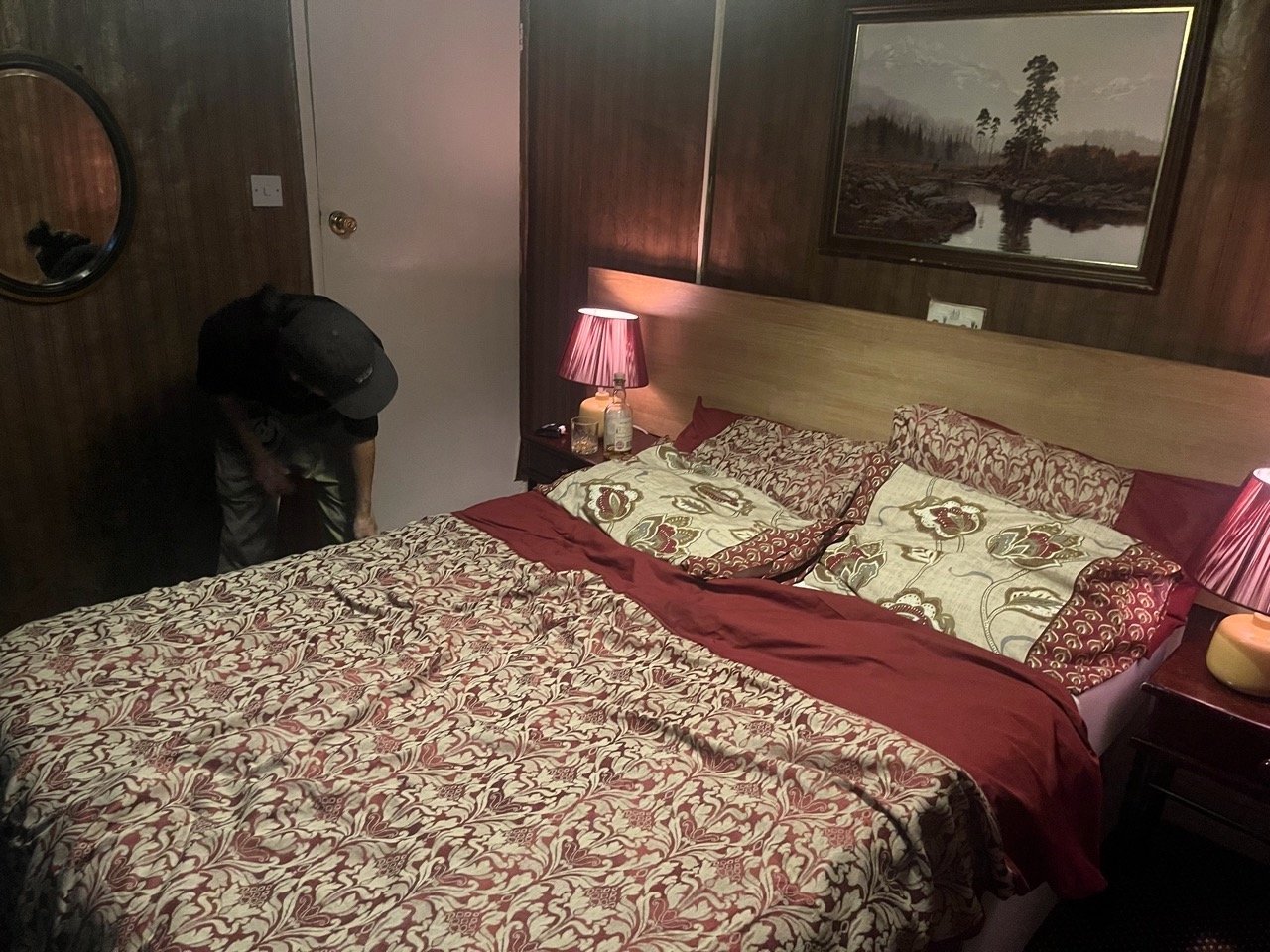
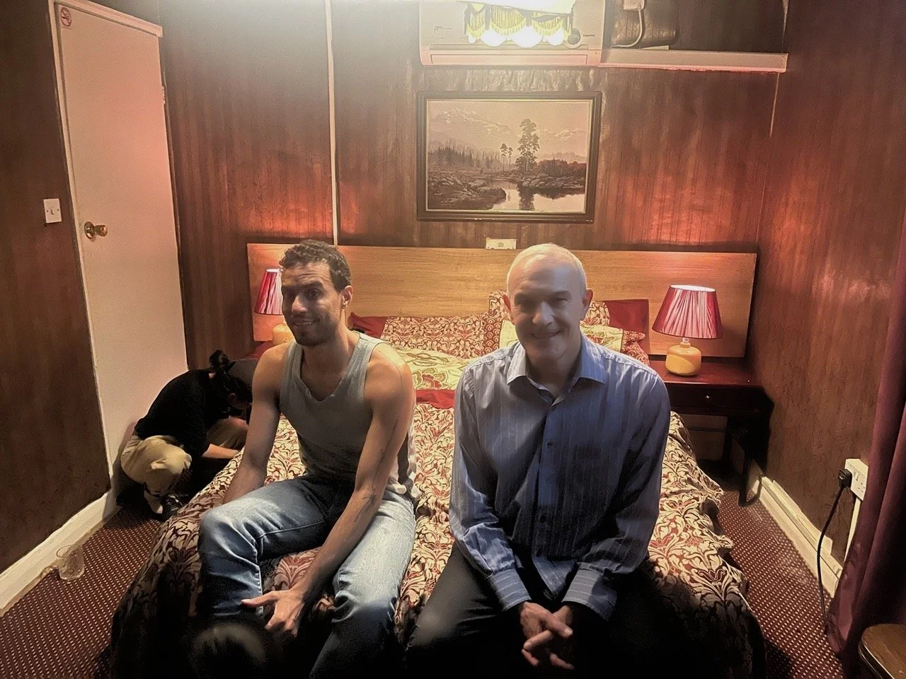
Bedroom:
The bedroom has to be reddish and warm but not stereotyped. For this reason, I thought it could be more like a hotel room refurbished in the 1970s or 1980s. To give it an atmospheric look, we used rich colours and cozy materials: wood, golden brown wallpaper, burgundy fabrics, ochre accents, and a bit of drama from the red lamps.

Colour scheme